

Home
------
1964-1965 New York World's Fair
Hong Kong Disneyland
------
Other Appearances (?)
------
Merch (?)
Scan Archive (?)
-----
Clockboy
Lore
-----
Freebies
Disneyland
This page will have all the info I have on the Disneyland version of IASW's facade!
NOTE: The information on this page may not be 100% accurate at this moment in time! I will remove this notice once I triple check my information; I just wanted to get the basics on this page. :-)
Additionally, the formatting is a little bugged at the moment, and I will work on making it prettier as soon as I can!

The Move From the Fair to Disneyland (1966 - 1980's)
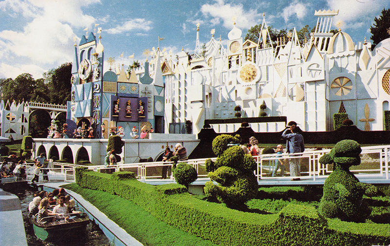
When moving the attraction from New York to California, Disney knew the very visible show building would be an aesthetic nightmare. Since the attraction was essentially completely built (additional show scenes were added in the Disneyland version), they had more time to focus on the façade. Mary Blair, seemingly most known for her work on Disney’s Alice in Wonderland, was initially assigned to work on the façade. Since she essentially lead the art direction for the attraction itself, it made sense to have her design the outside as well. However, Blair struggled to make a façade that could translate well into three dimensions. Rolly Crump took over, using Blair’s initial design sketches for inspiration, deciding to go along with the building block type theme.
After designing the back layers of the façade that hide the show building, Walt Disney and Crump went back and forth on what to put between the loading dock and the train tracks. One idea thrown around was a band stand/stage. When a clock was suggested, Walt told him to build it. (At some point, Crump consulted Blair again for the sketch of the clock; I am working on digging up this source again)
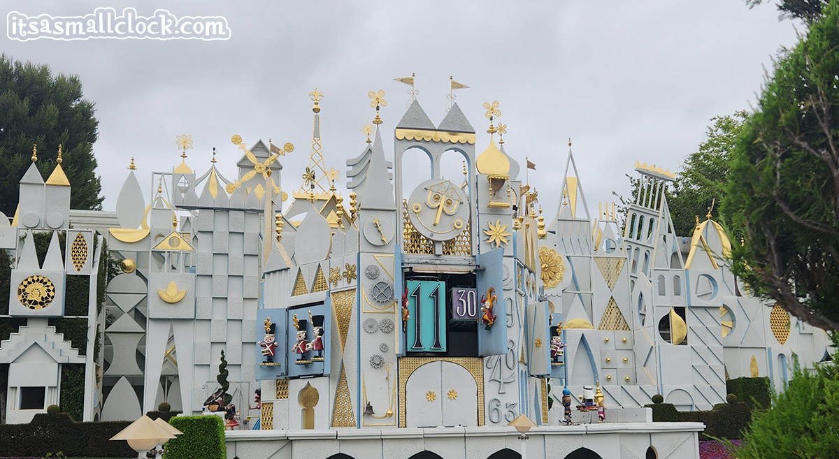
Despite the first concept being more colorful, the final façade ended up being mostly white due to concerns of paint colors fading, maintenance/cleaning concerns, and Blair’s opinion on the color white (that it’s the most festive color). The story goes that WED actually used the entire country’s supply of gold leaf for the accents, and had to import additional quantities from Europe. Due to this, the accents on the clock face were done in silver (another claim I need to find the source for again). The final product is what is, basically, still at Disneyland today: a white façade with gold and silver accents, featuring building block-like shapes and icons from around the world, with a clock tower being front and center.

The Corporate Synergy Update (1980's)
After over 15 years of operation, the façade received its first major renovation. Likely done to compliment the soon-to-be opened IASW in TDL, the façade in Disneyland was painted varying shades of blue. Unlike Japan, California has harsher sunlight, so this paint job lasted about 10 years before fading to the point of needing an update.

Pretty In Pink (1992 to 2005-ish)
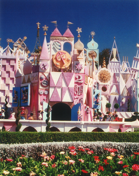
1992 was a complex year for the back end of the park. Due to the addition of ToonTown, behind the railroad tracks, parts of the façade needed to be removed. In addition to this change, the façade was also repainted to bright pinks and oranges. The original silver accents were replaced with warmer tones, and the clock face received new colors as well. The sponsorship at this time was switched to Mattel, so it is unclear if the pink was chosen to compliment the toy company, or done to slightly match the newly opened IASW at DLP (which at the time, featured pastels). This was another paint job that seemed to disregard the harsh sunlight in Anaheim, and the paint job faded over time.

Present Day
2005 marked 50 years of Disney theme parks, and many parts of the Disneyland Resort were spruced up. IASW was reverted back to its original colors in preparation for the celebration, this time boasting gold accents on the clock tower and face.


